How Style Frames, Moodboards, and Art Direction Actually Work Together
Moodboards, style frames, and art direction are not interchangeable. A moodboard gathers visual references, a style frame shows what a finished moment could look like, and art direction is the decision-making system that keeps the whole project visually coherent.
Design-room takeaway
Use the moodboard to explore atmosphere, use style frames to test the final look, and use art direction to decide what belongs, what does not, and why. When these tools are used in the right order, they reduce guesswork before production begins.
The three terms beginners mix up
A moodboard is an organized collection of visual references. It can include colors, textures, stills, type samples, lighting references, fashion details, environments, or interface fragments. Nielsen Norman Group describes mood boards as collages that communicate feeling at a glance, and that definition works beyond UX. In entertainment, illustration, motion design, and branding, a moodboard says, “This is the emotional and visual neighborhood we are exploring.”
A style frame is more specific. It is usually a polished still image that represents how a finished shot, scene, title card, animation, campaign, or key visual might look. It is not merely inspiration. It is a proposed answer. Tools and guides from motion-design workflows, such as Milanote’s guide to motion design style frames, frame style frames as a way to present the look of an animation before animating it.
Art direction is broader than both. It is the discipline of shaping the visual language so that each decision supports the concept, audience, brand, story, or experience. AIGA’s Eye on Design has noted how moodboard culture can lead to visual sameness when references become shortcuts instead of thoughtful decisions in its essay on moodboards and advertising homogeneity. That warning matters: art direction is not collecting attractive images. It is choosing a direction and defending it.
How the workflow usually moves
Most projects begin with a brief or problem. The team needs to know the audience, constraints, deliverables, message, timeline, and practical limits. From there, moodboards help explore visual territories. One board might feel spare and architectural. Another might feel handmade and tactile. A third might feel glossy, saturated, and celebrity-driven. At this point, the team is comparing directions, not finalizing assets.
Once a direction is chosen, style frames translate the mood into something closer to production. If the project is a title sequence, a style frame may show a key transition, a character silhouette, or typography over a textured background. If the project is editorial illustration, the style frame may show composition, color, line weight, and tone. If the project is campaign art, it may show the relationship between subject, environment, type, and negative space.
Art direction runs through both stages. It defines what the project is trying to make people feel, what visual references are relevant, how polished or raw the final look should be, and how each asset relates to the larger system. Without art direction, moodboards become scrapbooks and style frames become pretty pictures with no strategic spine.
A side-by-side comparison
| Tool | Question it answers | Typical stage | Risk if misused |
|---|---|---|---|
| Moodboard | What world are we exploring? | Research and concept | Becomes a pile of trendy references |
| Style frame | What could the finished look be? | Concept approval and pre-production | Looks polished but ignores feasibility |
| Art direction | Which visual choices serve the idea? | All stages | Turns vague if not tied to goals and constraints |
Why moodboards should stay flexible
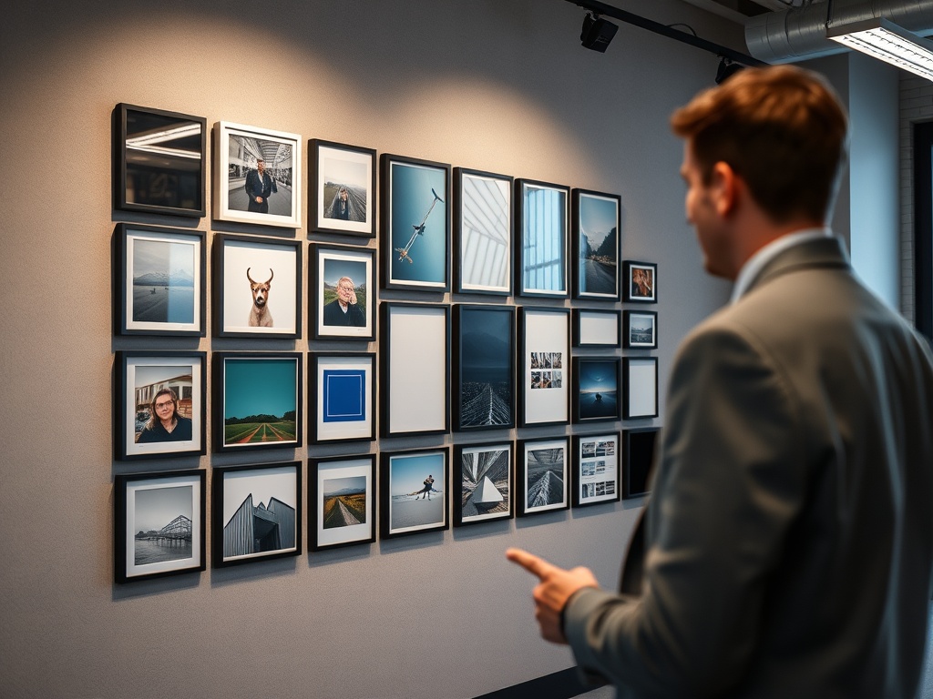
A good moodboard creates alignment without pretending to be the answer. It should communicate tone, not dictate every detail. Beginners often make boards too broad, mixing ten different visual languages in one place. The result is confusion. A more useful board has a clear point of view: “quiet archival warmth,” “sharp editorial contrast,” “playful handmade motion,” or “clinical sci-fi minimalism.”
One test is to remove any reference that does not help someone make a decision. If an image is only there because it looks nice, it may weaken the board. If it clarifies color, pacing, material, composition, era, lighting, or emotional register, it earns its place.
For artists and cultural writers, this distinction also helps when comparing creative environments. A public-facing art space has different visual pressures than a studio, gallery, or fair, a distinction explored in How Art Fairs Differ From Galleries, Studios, and Open Calls.
How style frames make the idea concrete
Style frames are where the team tests reality. Can the moodboard’s soft lighting work with the actual product? Does the typography survive over a moving image? Does the illustration style scale to multiple formats? Does the color palette still work after video compression or print conversion?
A strong style frame should be specific enough to invite useful feedback. Instead of asking, “Do you like the mood?” it asks, “Is this the right level of contrast, texture, framing, and finish?” That shifts the conversation from taste to direction. It also helps producers and animators estimate complexity before resources are committed.
Style frames do not need to show every scene. They should show the moments that carry the visual system: the opener, the busiest layout, the most emotional beat, the transition style, or the hero composition. If those frames work, the rest of production has a clearer target.
Art direction is the filter
Art direction decides what gets kept. A moodboard may include a dozen appealing references, but the art director has to ask which references serve the brief and which ones distract. A style frame may look striking, but the art director has to ask whether it fits the story, budget, medium, and audience.
This is why art direction can be invisible when done well. Viewers may not notice that a color never appears outside a specific emotional context, that props share a period logic, or that motion moves at a consistent rhythm. They simply feel that the piece belongs to itself. In that sense, art direction is less about decoration than coherence.
Common breakdowns and how to prevent them
The first breakdown is approving a moodboard as if it were final design. This usually leads to disappointment because the client expects the finished piece to duplicate references that were only meant to guide tone. Label moodboards clearly as exploratory.
The second breakdown is making style frames that ignore production. A frame with delicate grain, complex lighting, and layered illustration may look wonderful, but if the team cannot animate or reproduce it across deliverables, it becomes a trap. Ask production questions early.
The third breakdown is weak feedback. “Make it pop” is not art direction. Better feedback names the problem: “The palette feels too cheerful for the subject,” “The type hierarchy does not guide the eye,” or “The lighting reference conflicts with the documentary tone.” Clear feedback saves rounds.
A simple sequence for small creative teams
Start with a one-page creative brief. Build two or three moodboards, each with a distinct title and rationale. Choose one direction or combine carefully. Create three to five style frames that stress-test the look. Then write a short art-direction note that explains the approved visual rules: color, texture, composition, type, reference boundaries, and what to avoid.
That sequence works for motion graphics, editorial illustration, campaigns, video packages, and digital art projects. It also connects naturally to technical finishing work. Once the look is set, video teams still need disciplined color decisions, which is why How to Color Correct Video Without Overgrading It is a useful companion topic.
The approval question that keeps everyone honest
Before moving into production, ask one question: “Can someone who missed the meeting understand the visual direction from these materials?” If the answer is no, the moodboard, style frames, or art-direction notes need tightening. Creative tools only work when they transfer judgment from one person’s head into a shared system.
Keep the references lean, the frames purposeful, and the direction written plainly. That is how these tools stop being presentation clutter and become a practical bridge from idea to finished visual work.